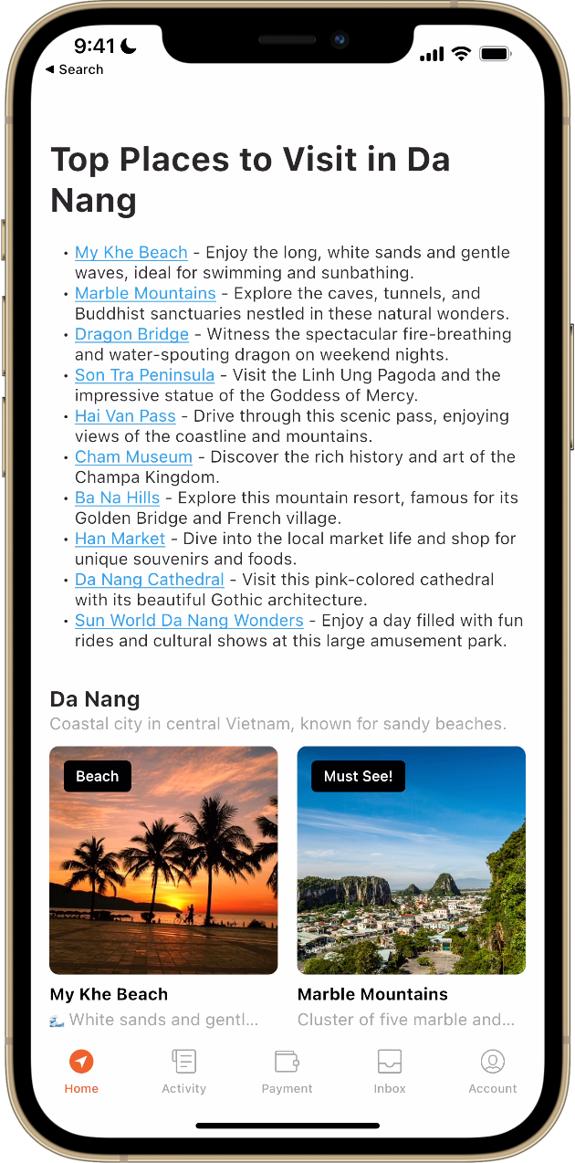
Components Overview
Components Overview
Introduction
Welcome to the Menu Maker tutorial! In this guide you'll explore the diverse components available in Menu Maker, allowing you to construct a dynamic and engaging super app home screen. Whether you're looking to direct users to different parts of your app or link to external web URLs, these components offer customizable options to enhance user interaction.
Navigation Options
Menu Maker provides two primary methods for directing users within your app:
- Web URLs: Open specific external links directly from your app. This is ideal for partnerships with third-party apps, reward programs, or booking platforms.
- Deeplinks: Navigate users to specific sections of your app using deeplink URLs. For detailed routes, please refer to our App Deeplink Routes documentation.
Note: Once you finalize your menu design you will need to contact your account manager to enable the menu to be shown to your customers. You can create different menus for different geofences, or toggle certain menus on and off during certain seasons or special events.
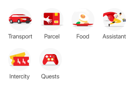
Service Icon
- Deeplink to different parts of the customer app
- Open browser links (Useful for 3rd party apps, reward programs, or booking platform partnerships)
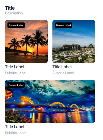
Grid
- Layout: Displays thumbnails in a vertically scrolling grid format.
- Customization: Supports both square and landscape thumbnails, each accompanied by a title, description, and tag label.
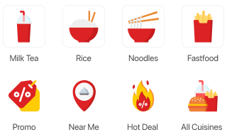
Icon
- Purpose: Primarily used for categorizing offerings such as food delivery or grocery services.
- Features: Allows users to filter options by categories like 'Fast Food', sorted by proximity, ratings, etc.
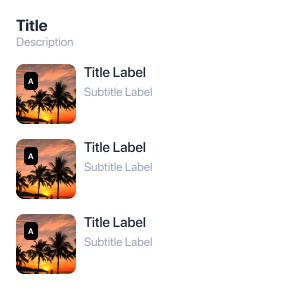
Vertical
- Design: Features a scrollable vertical list with an image on the left followed by a title and description.
- Application: Useful for displaying a series of items or services in a concise format.
Label - Custom HTML
- Utility: Offers the flexibility to add custom HTML content like terms & conditions or formatted text.
- Limitations: Best suited for basic HTML; advanced elements like iframes or complex scripts are not recommended.
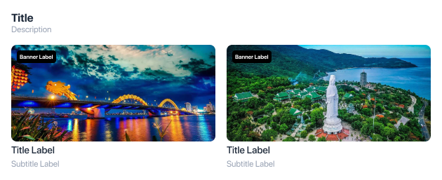
Horizontal Rectangle
- Ideal for showcasing landscape images or banners in a horizontal layout.
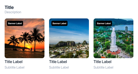
Horizontal Square
- Perfect for displaying square images or icons in a horizontal scroll.
Single Banner
- Single Banner: Use the single banner component for prominent displays or announcements.

- Banner Billboard: Larger than standard banners, designed for high-impact visuals.

- Banner Indicator: Includes indicators for carousel-type navigation between banners.